The one I didn't quite get was the Malayan Tapir one at Port Lympne where the main image is the tapir underwater, as viewed from over the water. So it's the nose of the tapir then a big black and white blur!
The one I didn't quite get was the Malayan Tapir one at Port Lympne where the main image is the tapir underwater, as viewed from over the water. So it's the nose of the tapir then a big black and white blur!
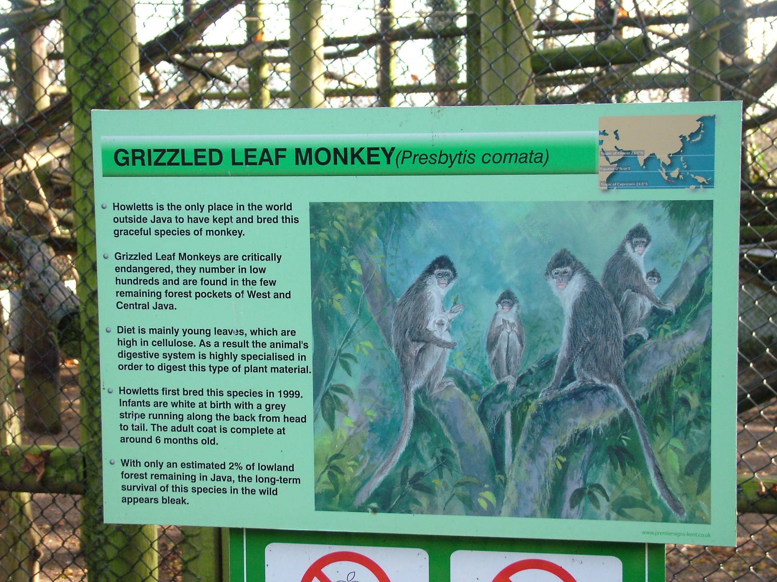
Yes, that is an odd one- it doesn't work quite so well as the others. Generally speaking, the artwork cleverly manages to give an impression of the species' natural habitat far more effectively than any amount of words.
How much do you think these signs cost for Howletts and Port Lympne?
They are very good quite basic signs but they do work very well. I agree the Artists Impressions are fantastic.
i preffered the old signs at the Aspinall parks , they werent very colourful but they had some beautiful illustrations which were alot more convincing then these ones , and also the information was in a very john aspinall way , precise,proper and scientific without indulging in any "fun facts" or such things