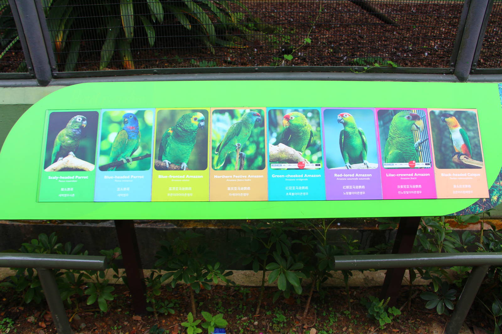
They seem to be going towards a more "homogeneous" sign design for their exhibits, one which obviously is much more vibrant, vivid and eye-catching. Goes along very well with their "where colour lives" slogan, but personally would prefer slightly more details about the birds in their signage (am aware that there is some explanation for the more iconic/popular species in these display zones (heliconia walk, wings of asia etc.))