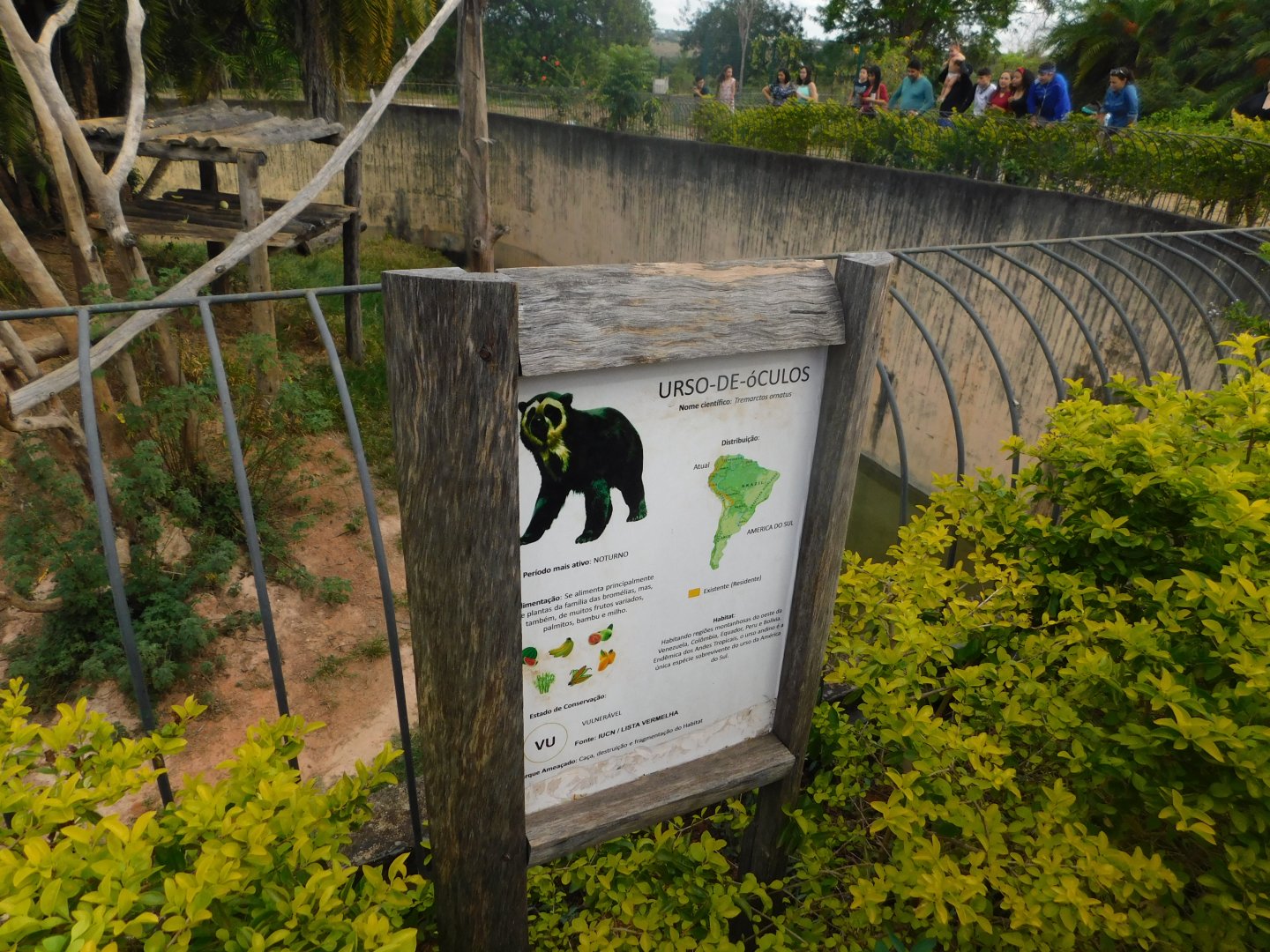
I definitely prefer the signs at Brasilia zoo to those at Sorocaba and Sao Paulo. Not too minimalistic but neither are they overwhelmed with information and the illustrations are quite nice and traditional too.
@Onychorhynchus coronatus
Oh, yeah, definitely. From pictures I've seen, zoo São Paulo has some quite small signs, right?
I also liked the naturalistic look that this rustic wood gives to zoo Brasilia's signs. The only issue is that it is located a little far from the viewing platform (not further than zoo signs usually stay, but the text of the sign is in very small letters, so it would be better if it was nearer than usual, or increased the size of the text). I also enjoyed the ilustrations and informations about the animal's diet, wich personally, I don't remember having seen in any other zoo.
The signs at zoo São Paul are not terrible by any means but I just don't really like the sort of colourful / powerpoint aesthetic style which they are presented in. It somehow feels a bit too generic and impersonal.
In contrast, judging by your pictures the information signs at the Brasilia zoo have a more rustic and traditional "old school" aesthetic that I prefer.