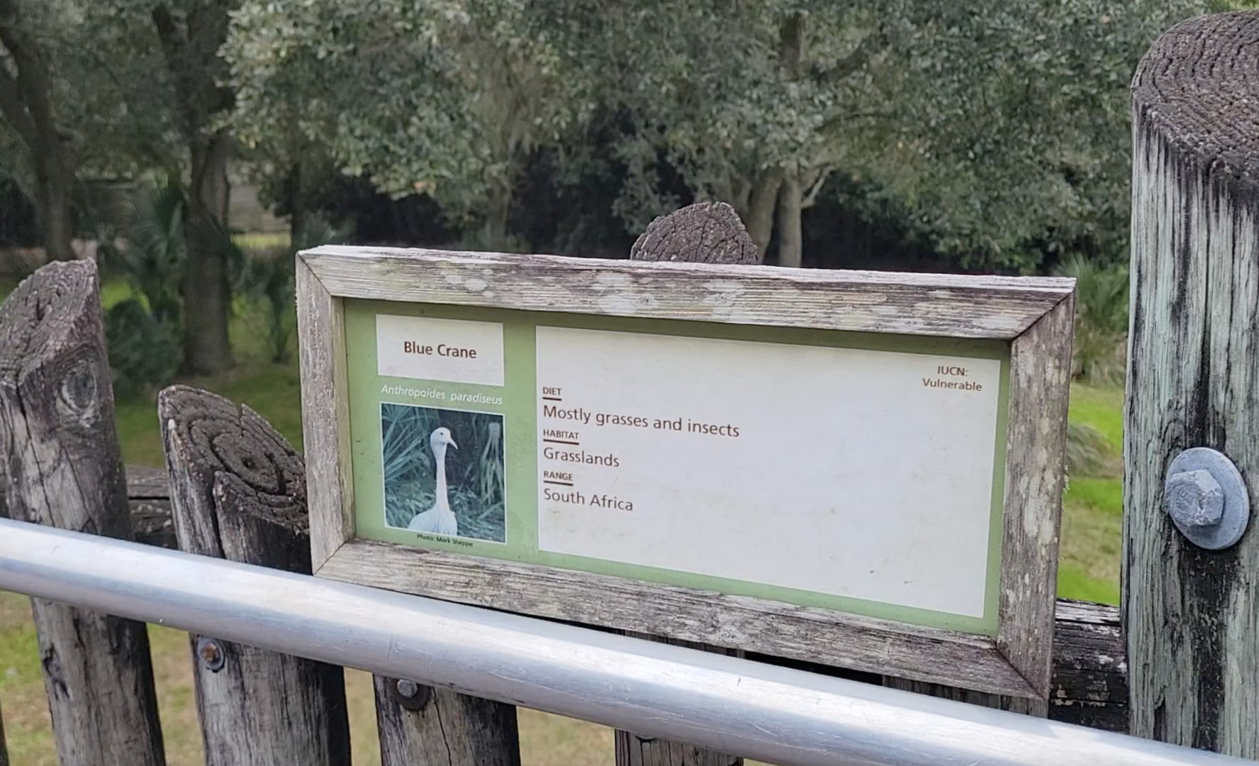
Most likely in response to choosing a career path towards graphic design, something last year clicked inside of my mind that made me grade zoos partially on its educational intentions (mostly with signage). I enjoyed Jacksonville just about as much as any other zoo, but aside from a few detailed signs regarding jaguars and manatee rescues, I kid you not when I say the ID card above is generally about as educational as it gets around the rest of the park. Even in the newer parts of the zoo and the award winning areas - and if there are other detailed signs other than the ones I mentioned, they're 'thank you's' to their donors. Hopefully this will be fixed in the master plan.
I'm not saying every zoo needs to go 'all out' like the example below, but this shows less than half of what Nashville created for their tiger exhibit: May. 2019 - New! - Tiger Crossroads - ZooChat
This was one of my chief complaints about Jacksonville when I visited last month. I loved this zoo and it was one of my favorites from my Orlando/Tampa trip, but as someone who loves reading signage, I was disappointed with the overall quality of the signage used at the zoo.
I took pictures of all signs (so I can track what species I observed) and can confirm that almost the entire zoo is like this; utilizing the basic "who/what/where" template even on newer exhibits like Land of the Tiger.
It also doesn't help that some signs, particularly on the Africa loop, are placed fairly low on the fence, where they not only blend in, but can also be blocked by people standing at the fence.
That said, it's not all bad. The reptile house in Wild Florida, for example, has great signage, not only having the info seen in the picture above, but also including other animal facts on top of that. The Jaguar, Lost Temple building, and Manatee exhibits also have more detailed signage. Even the Amphibian center, despite using temporary laminated paper signage, had more substance to theirs than this.