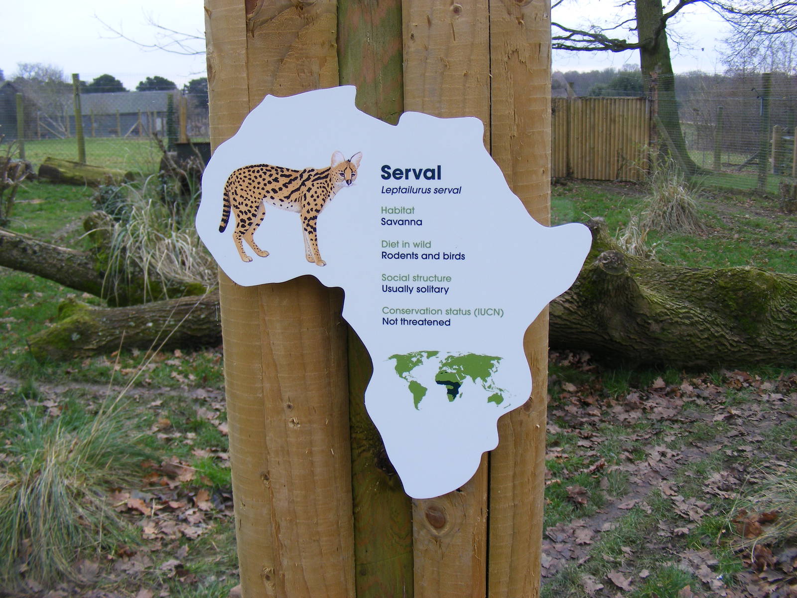
Actually I like this new style of sign,as for the amount of info what more do you need it tells you what it is,where it comes form,what it eats,how big a group it lives and how endangered it is,given that for alot of Joe Public even this is too much information,I think its very good sign!
They do a guidebook, however the information is very limited (eg the Somali Wild Ass is just 'This is one of the most endangered animals that we have at Marwell - a really precious sight' and nothing else) with only about half the animals represented; servals aren't mentioned at all. It strikes me more as a glitzzed-up leaflet with more emphasis on the visitors than the animals (for example, the main image for Into Africa is someone wearing a giraffe backpack with the actual animal blurred completely behind it). They'll be printing them on an annual basis AFAIK, so hopefully they can expand their animal info this year.
And while I agree it it is nicely presented, I still think more information is needed, especially if presented in an interesting manner that doesn't look like an essay draft. What's wrong with little fact boxes explaining in a few sentences how servals are adapted to living in the savannah or how they can catch birds already ten feet in the air?
Totally agree with Zambar, above. This is just pitiful. If this all that can be said about a species, then what is the point in keeping it at all? Surely Marwell can find a story to tell through its servals? Further evidence, I fear, of a zoo which for several years has been going horribly off the rails.
I like the design of the sign, although I'm not sure how well it would translate to animals from other continents. The shape of Africa means the picture and the text sit nicely without being crowded. However while I like the design I do not like the lack of information. It would be nice if there could be this sign for the visitors who don't want any more than a soundbite, plus a more informative sign for those visitors who want more information.
I too rather like the layout and the shape (though as Chli says, how it would work with less conveniently shaped continents I'm not sure), but this would be improved immeasurably just by a paragraph or two for some other information (like the catching-birds-from-the-air thing). The information here is all well good, but rather dry and uninspiring.
Aesthetically it's nice, fresh almost. Informativley its a little lose, however we are all bias and must remember that a.) A sign is better than no sign and b.) The important stats are there for the average zoo visitor!