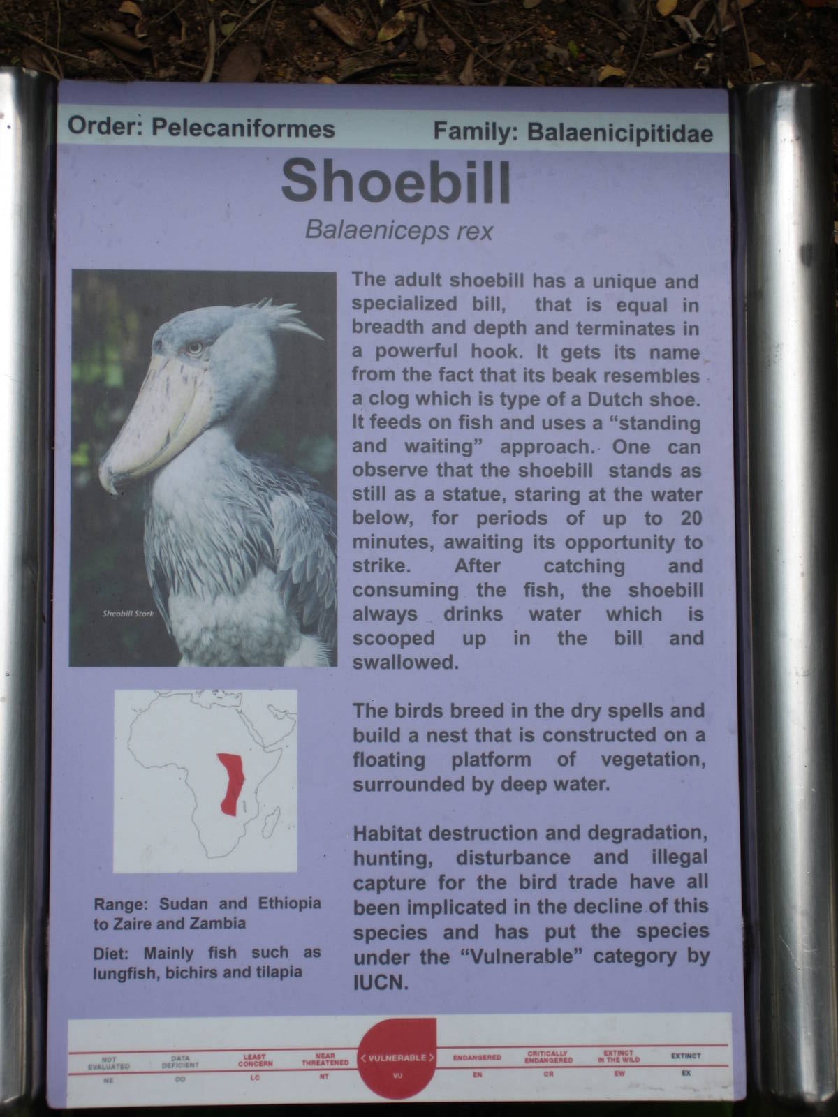
The information provided seems much more useful, the old signs just had names, picture, distribution map, and a couple of facts, which were often irrelevant to the bird, e.g. "Scarlet Macaw - This is probably the best known of all South American parrots as it is often used in advertisements".
I still find the new signs bizarrely boring however, with no interesting graphics or modern design. They don't look like they belong in a world-class zoo like Jurong.
Didn't even notice those! Some have little paragraphs under the English, but in much smaller size. You probably need to zoom into this picture to see them.
Signage is a bit of problem for Jurong because the birds (smaller ones especially) are moved about quite frequently (for reasons beyond my knowledge) or simply die out quickly. To produce high-quality permanent signs may not make economic sense if they have to be frequently replaced. They've resorted to using temporary laminated print-outs for some of the displays.