This is a carry over from at least the last three or four Chester map designs - basically ever since they started adding animal icons they've only ever added them for an arbitrary number of keystone species.
Basically it's not an icon map, it just has icons to call your eye to a few notable exhibits.
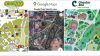
Both of these are direct carry-overs from the previous map design you liked better - they are using the same list of labels and the same coloured zones.

On this map, what the coloured zones add is saving you searching the whole map if you're trying to look up an enclosure location from the list of labels. If I recall London doesn't really use them for anything?
EDIT: Oh, also, adding new exhibits to the map in a completely inconsistent way is
very classic Chester map - as Madagascar was added partway through the last design that's why it's all lumped in.