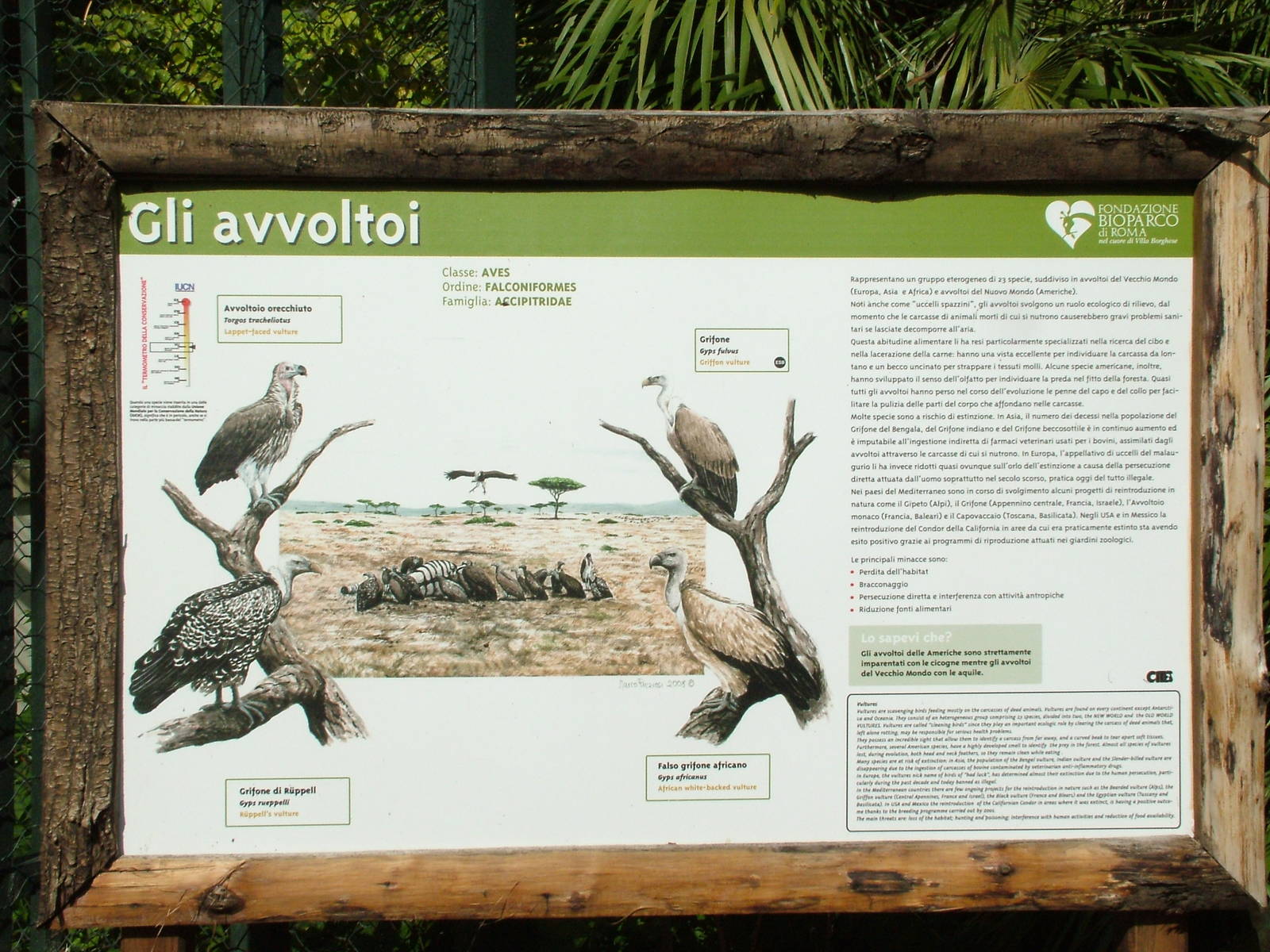
now that's what a zoo label should look like, in my opinion! Nice pictures of the animals (paintings too, which I like better than photos if only because it gives the impression that more effort has been put into it); easy to tell what's in the enclosure for those visitors who just want to know at a glance what to look for; and yet also a good amount of info at the side for those of us who like to learn more - the taxonomy even, with the Class, Order and Family at the top. Very well done.
What is the thermometer-looking diagram at the top left? Population or status maybe?
Yes, the cage is not quite as impressive as the sign - it is quite spacious but not very tall (though I think it looks smaller in that photo than reality - I've certainly seen a lot worse).
I would suggest that aside from the attractive illustrations, this is an example of how NOT to do a zoo graphic. The number of visitors who actually read the dense paragraphs of text crammed onto the sign must be miniscule. And even the small percentage of people who might be inclined to read would find it very hard to determine which of the various "chapters" to study, given the lack of headlines, highlighted key statements etc!
Dozens of studies confirm that information that is to be successfully conveyed in a "drive-by" setting like an animal exhibit at a zoo must be far more condensed and presented with clearer informational hierarchies than is the case with this all-too-common sign-as-textbook example
In my experience, condensing down information usually leads to it being condensed down to being just wrong (at least one zoo I've visited recently was informing visitors that bongo are the biggest antelopes, and a Colchester label in the gallery famously claims Cuban Hutias are 'also known as tree kangaroos') or else to being infuriatingly trite and patronising ('vultures are the bin men of the natural world, cleaning up after other animals').
I'd much rather a solid sign like this than the half-hearted things you get most places.
That said, that is a fair old block of text that would probably benefit from being broken up a bit.
I agree with Maguari completely, but likewise would grant that yes the text would benefit from some breaking up with headings into segments.
I guess opinion comes down to whether one wants to be able to actually learn something from the signage or whether one needs things to be dumbed down. I think reduakari completely missed the point as usual; people who aren't inclined to read aren't going to - it doesn't matter if its in little quips or in (gasp!) proper sentences or paragraphs, they're just going to look at the picture of the animal, say "oh birds" and move on. The text should be there for those actually interested. Otherwise you end up with this sort of thing: http://www.zoochat.com/15/example-signage-162892/
My deepest apologies for "missing the point as usual," but I would ask you to do a fairly elemental review of the robust research that has been conducted into interpretive messaging in zoos and museums over the past 3 decades. Should you deign to engage in such a review, you would understand that my point of view is well backed by empirical research into visitor interest, behavior and comprehension. People do not visit informal science education facilities such as zoos to read voluminous quantities of text--anyone who wants to do this can with a couple of digital clicks before, after or now during a visit. There are far more effective ways of conveying prioritized messages than this classic example of curatorial conceit ("I think this litany of facts is important, therefore you shall too...").
And by the way, I would hazard a guess that the graphic you present as an example of "dumbing down" is read and comprehended by many more visitors than the dense mini-encyclopedia of the Bioparc Rome hornbill treatise/label. Not that it is attractive, well-designed or well-written, but it gets to one basic message instead of trying to convey dozens of different (and less critical) ideas.
I'm with reduakari on this one (well, in post #6 at least).
The illustration is good, the status thermometer is good, but there is way too much text for a 'label'. The average zoo visitor (and I don't consider anyone on ZooChat to fall into that category) will not read all that stuff about vultures. Too much text, and the bottom paragraph looks like an even smaller font. The average visitor may even look at the label and be put off by the text and not even bother to look for the simple stuff like name, habitat, diet etc. Remember, Mr Average would rather see animals doing something and move onto the next animal than read alot of text, especially if he has kids with him.
Better to have a label (like the graphic side of it) with some basic information, and the more detailed info on another sign nearby. That way Mr Average can have a quick look at the label and get the info he needs, and Mr ZooChat can spend longer at the other sign.
As to the Campbell Teal label, yes it's disappointing from one point of view, but as reduakari says - it communicates a conservation message very effectively. For some visitors reading about endangered species and conservation all day becomes mopnotonous and you can get to a poiint where you just don't care (I knew a Zoo Director like that once), and this sign effectively gets a message across quickly.
Having said that, if that was my zoo I would at least have the scientifc name and a distribution map on there, and have another two or three similar signs nearby with different facts and information.
@Maguari's point that condensing it increases the chance of mistakes and misinformation - my experience is that mistakes and misinformation are not the sole domain of condensed labels. Mistakes and misinformation will be made if the quality of the final product is not checked by someone who knows the facts. All too often labels and signs are made by a graphics Dept, often with input from PR or marketing who are experienced in writing copy, and they are so sure of their research they don't bother to check the final product with a keeper or curator.