Not that it is attractive, well-designed or well-written, but it gets to one basic message instead of trying to convey dozens of different (and less critical) ideas.
Personally, one of my pet hates is interpretation that's only concerned with how rare the animals are. That's important, yes - but is not automatically more important than learning about the animals themselves. That teal label tells you nothing about the nature of the actual animals.
And no scientific name is an automatic fail for me. No scientific name = rubbish sign. It's two/three words - if it means nothing to you it's easy to skip over and if you're interesting enough to want it it really should be there.
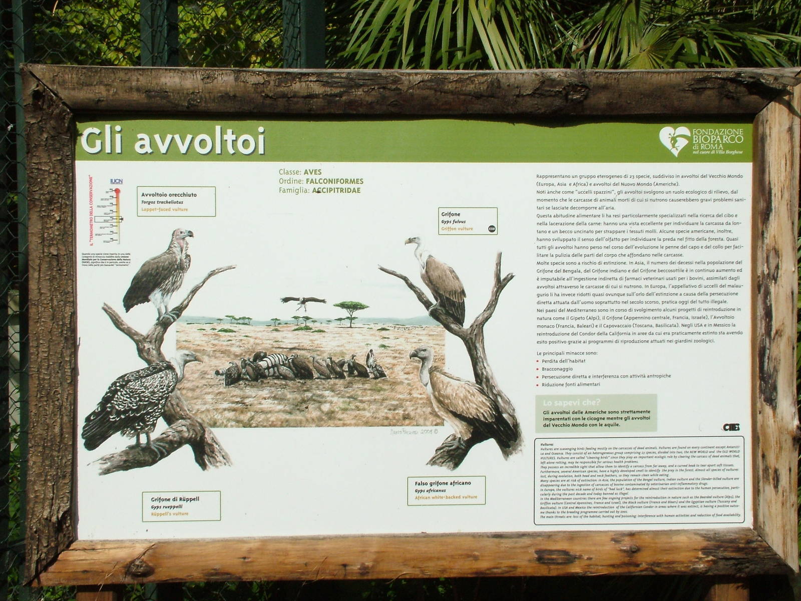
The illustration is good, the status thermometer is good, but there is way too much text for a 'label'. The average zoo visitor (and I don't consider anyone on ZooChat to fall into that category) will not read all that stuff about vultures. Too much text, and the bottom paragraph looks like an even smaller font. The average visitor may even look at the label and be put off by the text and not even bother to look for the simple stuff like name, habitat, diet etc. Remember, Mr Average would rather see animals doing something and move onto the next animal than read alot of text, especially if he has kids with him.
Better to have a label (like the graphic side of it) with some basic information, and the more detailed info on another sign nearby. That way Mr Average can have a quick look at the label and get the info he needs, and Mr ZooChat can spend longer at the other sign.
As to the Campbell Teal label, yes it's disappointing from one point of view, but as reduakari says - it communicates a conservation message very effectively. For some visitors reading about endangered species and conservation all day becomes mopnotonous and you can get to a poiint where you just don't care (I knew a Zoo Director like that once), and this sign effectively gets a message across quickly.
See my point above about over-emphasis on conservation in the interpretation. If the visitors are becoming zoned-out because it's all 'look how rare I am', why not give them some information about the actual animals from time to time?
(Granted, Campbell Island Teal is not a great example for this, as it's conservation story is maybe the most interesting story to tell about it anyway!)
my experience is that mistakes and misinformation are not the sole domain of condensed labels. Mistakes and misinformation will be made if the quality of the final product is not checked by someone who knows the facts. All too often labels and signs are made by a graphics Dept, often with input from PR or marketing who are experienced in writing copy, and they are so sure of their research they don't bother to check the final product with a keeper or curator.
Sadly very true. But if the sign is condensed to one or two facts and they end up wrong then the error is compounded, becuase potentially everything you're telling people about the animals is wrong.
Another example - the new Tuatara signage at Chester. This is the main sign; there are additional ones with further information, incliuding conservation, but this is the main species label.
Much better balanced? A good range of information (about the actual animal!), scientific name and a combination or artwork and photography. And even a 'Did you know?' for Mr Average (more recent signs have drawn more attention to these, as the Giant Otter sign - http://www.zoochat.com/42/new-signage-chester-25-04-10-a-147049/).
once again I have to agree completely with Maguari's above post (we're not really the same person...honest )
reduakari said:
My deepest apologies for "missing the point as usual," but I would ask you to do a fairly elemental review of the robust research that has been conducted into interpretive messaging in zoos and museums over the past 3 decades. Should you deign to engage in such a review, you would understand that my point of view is well backed by empirical research into visitor interest, behavior and comprehension. People do not visit informal science education facilities such as zoos to read voluminous quantities of text--anyone who wants to do this can with a couple of digital clicks before, after or now during a visit. There are far more effective ways of conveying prioritized messages than this classic example of curatorial conceit ("I think this litany of facts is important, therefore you shall too...").
And by the way, I would hazard a guess that the graphic you present as an example of "dumbing down" is read and comprehended by many more visitors than the dense mini-encyclopedia of the Bioparc Rome hornbill treatise/label. Not that it is attractive, well-designed or well-written, but it gets to one basic message instead of trying to convey dozens of different (and less critical) ideas.
actually I am quite familiar with the limited attention span and intelligence of modern humans, and I am also very familiar with the studies into how little attention visitors to zoos (for example) pay to signage. But as Maguari says, "Why must everything be aimed at people determined to avoid actually knowing anything?". I take from the quotation marks (re "dumbing down") in your last paragraph that you think the teal sign is perfectly adequate as far as the amount of information goes, but I totally disagree. However I think you have also quite capably proved the point you were trying to make that people who are not inclined towards education won't bother looking at a sign such as the Bioparco Roma one - because it is in fact a sign for vultures!
Hix said:
Having said that, if that was my zoo I would at least have the scientifc name and a distribution map on there, and have another two or three similar signs nearby with different facts and information.
actually there is a distribution map on the sign (at the top) - but if a zoo enthusiast and someone who is critically looking at the sign in terms of its education value can miss it, then what chance does your average zoo-goer have?
actually there is a distribution map on the sign (at the top) - but if a zoo enthusiast and someone who is critically looking at the sign in terms of its education value can miss it, then what chance does your average zoo-goer have?
OK, my bad. I thought it was a map of NZ, to indicate a native species. Didn't realize the circle down the bottom was where they are found.
@Maguari: Those labels/signs are brilliant, particularly the Tuatara one. I'd still include a distribution map (map of the world or something like that) although I am aware some people have no comprehension of maps and geography whatsoever, but I'd still do it anyway.
the little distribution map on the teal sign looks more like part of the design than an informational tool.
I'll add that, as I stated in my initial post, all the above is just my own opinion. I understand reduakari's points but I don't agree that signage needs to be so simplistic as to be insulting. I think the best strategy (one I myself would put into practice if I owned a zoo) would be to have a proper (from my point of view) sign in combination with other signage comprised of simpler eye-catching graphics for the less able-minded, as Hix was saying in post #10
Hix said:
Better to have a label (like the graphic side of it) with some basic information, and the more detailed info on another sign nearby. That way Mr Average can have a quick look at the label and get the info he needs, and Mr ZooChat can spend longer at the other sign.