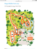
Perhaps it would be a good idea to give the date for this... Many others from that era were similar. I visited the Norfolk Wildlife Park many times, and always found the map fine. This one gives a very clear view of the early park, before the arrival of animals like the brown bears, lynx, wolves, raccoon dogs etc which were all unusual animals in their day. The ornamental pheasants block 9 was not there, even on my first visit, and had been moved to the Ornamental Pheasant Trust's private area behind the house and off-view to the bottom of the map. As it stands this map provides a clear memory of the park as it was. It is great to see it and be reminded of a bygone age.Doesn't seem difficult to understand at allas I have noted on my guidebook thread, there have been some significantly WORSE maps.
For instance....

You are using an out of date browser. It may not display this or other websites correctly.
You should upgrade or use an alternative browser.
You should upgrade or use an alternative browser.
Corangurilla
Well-Known Member
This just in: LA changed their map back to the Martin Schwartz design, hooray!
https://s36593.pcdn.co/wp-content/uploads/2022/04/LAZooMAPEXTERIOR_2022_web_f.pdf
Why did they ever revert it to the old one in the first place?
Anyways, I've got a question for everyone here: Color-coded zones on maps (like with San Diego, Tampa, Oregon, Cheyenne Mountain, or Columbus), yay or nay? Do they make the maps look more visually appealing or are they just tacky? Do the colors of the zones matter?
Perhaps it would be a good idea to give the date for this... Many others from that era were similar. I visited the Norfolk Wildlife Park many times, and always found the map fine. This one gives a very clear view of the early park, before the arrival of animals like the brown bears, lynx, wolves, raccoon dogs etc which were all unusual animals in their day. The ornamental pheasants block 9 was not there, even on my first visit, and had been moved to the Ornamental Pheasant Trust's private area behind the house and off-view to the bottom of the map. As it stands this map provides a clear memory of the park as it was. It is great to see it and be reminded of a bygone age.
Oh, indeed - my post was more intended as a rebuttal of the "literally nothing in the universe that is worse" hyperbole aimed at the Miami Seaquarium map
and you are definitely correct about the style being commonplace in the 1960s and early 1970s. It would perhaps be more fair for me to say that the issue is one of visual aesthetic rather than function and ease-of-use.... this map is, at least, not rendered in garish tones of electric pink like some of the Belle Vue and Chessington maps at the time!Los Angeles reverted to the old version so they could show which parts of the zoo were closed for COVID. It’s hard to show which paths and sections are closed with the new design.This just in: LA changed their map back to the Martin Schwartz design, hooray!
https://s36593.pcdn.co/wp-content/uploads/2022/04/LAZooMAPEXTERIOR_2022_web_f.pdf
Why did they ever revert it to the old one in the first place?
Anyways, I've got a question for everyone here: Color-coded zones on maps (like with San Diego, Tampa, Oregon, Cheyenne Mountain, or Columbus), yay or nay? Do they make the maps look more visually appealing or are they just tacky? Do the colors of the zones matter?
Brookfield Zoo actually has two current in-use maps, which I think is a great compromise. The commonly available map is a more artistic choice, but there is a minimalist map available to visitors with disabilities who may have sensory issues.

This is the current map, variations of which have been used since the 2000s. I think the most recent print version includes the name of the plaza that is empty here. The animals are pretty clear into telling you what is where, but also the paths are VERY clear and easy enough to follow, not blurring into the buildings or green areas.
Here is an older version for those who may be curious. I was considering uploading my own copy of this version to the gallery for historical reference...

This is the minamlist version, which has been adjusted a little over the years: I think a different version was in use on my visit in 2017 when we needed a copy for a disabled relative who visited with us.

I actually really love that the zoo makes multiple options available! I think more zoos would benefit from this approach. My preference is obviously the more artistic map but I could see myself using the minimalist one in certain situations.
On the opposite hand...

I've never been a big fan of Milwaukee's zoo map and it wasn't even easy to find a good one online right now. (This is pre-Adventure Africa, accurate to my visits though!) I don't feel like we need every version to include the parking lot although I can see why it would help some. The text is so tiny even on a physical map, a lot of it requires glancing at the key to figure out, and obviously the map has only the tiniest of silhouettes, and many of the enclosures aren't individually labeled. This has been the same format for maps going back to the 1970s:

This is the current map, variations of which have been used since the 2000s. I think the most recent print version includes the name of the plaza that is empty here. The animals are pretty clear into telling you what is where, but also the paths are VERY clear and easy enough to follow, not blurring into the buildings or green areas.
Here is an older version for those who may be curious. I was considering uploading my own copy of this version to the gallery for historical reference...
This is the minamlist version, which has been adjusted a little over the years: I think a different version was in use on my visit in 2017 when we needed a copy for a disabled relative who visited with us.
I actually really love that the zoo makes multiple options available! I think more zoos would benefit from this approach. My preference is obviously the more artistic map but I could see myself using the minimalist one in certain situations.
On the opposite hand...
I've never been a big fan of Milwaukee's zoo map and it wasn't even easy to find a good one online right now. (This is pre-Adventure Africa, accurate to my visits though!) I don't feel like we need every version to include the parking lot although I can see why it would help some. The text is so tiny even on a physical map, a lot of it requires glancing at the key to figure out, and obviously the map has only the tiniest of silhouettes, and many of the enclosures aren't individually labeled. This has been the same format for maps going back to the 1970s:
Of course now Brookfield has no options available, since they no longer offer paper maps. It makes navigation quite a pain.Brookfield Zoo actually has two current in-use maps, which I think is a great compromise. The commonly available map is a more artistic choice, but there is a minimalist map available to visitors with disabilities who may have sensory issues.
This is the current map, variations of which have been used since the 2000s. I think the most recent print version includes the name of the plaza that is empty here. The animals are pretty clear into telling you what is where, but also the paths are VERY clear and easy enough to follow, not blurring into the buildings or green areas.
Here is an older version for those who may be curious. I was considering uploading my own copy of this version to the gallery for historical reference...
This is the minamlist version, which has been adjusted a little over the years: I think a different version was in use on my visit in 2017 when we needed a copy for a disabled relative who visited with us.
I actually really love that the zoo makes multiple options available! I think more zoos would benefit from this approach. My preference is obviously the more artistic map but I could see myself using the minimalist one in certain situations.
On the opposite hand...
I've never been a big fan of Milwaukee's zoo map and it wasn't even easy to find a good one online right now. (This is pre-Adventure Africa, accurate to my visits though!) I don't feel like we need every version to include the parking lot although I can see why it would help some. The text is so tiny even on a physical map, a lot of it requires glancing at the key to figure out, and obviously the map has only the tiniest of silhouettes, and many of the enclosures aren't individually labeled. This has been the same format for maps going back to the 1970s:
Corangurilla
Well-Known Member
Ugh, really? Does Lincoln Park not offer them, either? I don't think they offered me one when I went last August.Of course now Brookfield has no options available, since they no longer offer paper maps. It makes navigation quite a pain.
I don't think Lincoln Park offers any either, but navigation isn't as difficult there.Ugh, really? Does Lincoln Park not offer them, either? I don't think they offered me one when I went last August.
Corangurilla
Well-Known Member
You say that, but I couldn't find the entrance to Regenstein African Journey without one...I don't think Lincoln Park offers any either, but navigation isn't as difficult there.
Yeah, I don't like Milwaukee's map, either. The interior of the "shoeprint" (my name for the Africa/Asia/South America/Cat House area) was particularly frustrating to navigate on my first visit, even with the map. Exhibits don't always have proper borders, there aren't enough animal silhouettes where they matter, if you told me this was for a zoo, I wouldn't believe you.Brookfield Zoo actually has two current in-use maps, which I think is a great compromise. The commonly available map is a more artistic choice, but there is a minimalist map available to visitors with disabilities who may have sensory issues.
This is the current map, variations of which have been used since the 2000s. I think the most recent print version includes the name of the plaza that is empty here. The animals are pretty clear into telling you what is where, but also the paths are VERY clear and easy enough to follow, not blurring into the buildings or green areas.
Here is an older version for those who may be curious. I was considering uploading my own copy of this version to the gallery for historical reference...
This is the minamlist version, which has been adjusted a little over the years: I think a different version was in use on my visit in 2017 when we needed a copy for a disabled relative who visited with us.
I actually really love that the zoo makes multiple options available! I think more zoos would benefit from this approach. My preference is obviously the more artistic map but I could see myself using the minimalist one in certain situations.
On the opposite hand...
I've never been a big fan of Milwaukee's zoo map and it wasn't even easy to find a good one online right now. (This is pre-Adventure Africa, accurate to my visits though!) I don't feel like we need every version to include the parking lot although I can see why it would help some. The text is so tiny even on a physical map, a lot of it requires glancing at the key to figure out, and obviously the map has only the tiniest of silhouettes, and many of the enclosures aren't individually labeled. This has been the same format for maps going back to the 1970s:
Pleistocene891
Well-Known Member
For artistic value, I love San Diego. It’s a piece of art.
iloveyourzoos
Well-Known Member
One thing I've been looking at recently is how rotational exhibits might complicate what a zoo needs to do with its map.
If your rotation is just moving animals of the same species into different, adjacent enclosures, then your map can stay mostly the same. But if you're rotating different species through enclosures, you'll need some sort of strategy. Even then, in most cases, it looks like the animals mostly stay in the same "section" of the zoo, so it becomes a little easier.
Here are some different strategies I've seen (and I'd love to hear about others too!)
Denver Zoo Map: https://denverzoo.org/wp-content/uploads/2022/03/GED-214_Maps_Web_Spring22_V1.0_JH_03-22-22.jpg
At Denver Zoo, the map simply doesn't mention the rotation in Predator Ridge (rotating African Lions, Spotted Hyenas, African Wild Dogs), nor the rotation in the Toyota Elephant Passage (rotating Asian Elephants, Greater One-Horned Rhinos, Malayan Tapirs). Animals are shown on the map as if they were in fixed locations. (The rotational nature is explained on their website and I'm told in signs at the zoo, but not on the map itself).
Louisville Zoo Map: https://iwc9c3sa3hy1j923hc1io8za-wp...021/11/11-23-2021-Zoo-Map-english-updated.png
At Louisville Zoo, the map takes a slightly different approach, simply listing the animals that are in their Islands Exhibit (rotating Orangutan, Sumatran Tiger, Siamang, Babirusa, and Malayan Tapir) and their Glacier Run (rotating Polar and Grizzly Bears, and fixed Seals & Sea Lions), without fixing them to a specific habitat or saying that they rotate -- just placing them in a general section of the zoo. (The Gorilla Forest also rotates gorillas, but it seems to be the same species rotating between habitats, so not a problem for map makers).
Point Defiance Map: https://www.pdza.org/wp-content/uploads/2022/06/PDZA_Map_6-22-web.pdf
By contrast, Point Defiance's map shows what at first glance looks like fixed exhibits with animals attached, but when you look closely they are shown in dotted lines with a note that "animals move among habitats daily". The images reflect some, but not all of the species in their Asian Forest Sanctuary (rotating Sumatran Tiger, Asian Elephant, Clouded Leopard, Lar Gibbon, Malayan Tapir, Lowland Anoa, Indian Crested Porcupine, Siamang, and Asian Small Clawed Otter).
I'd be curious if other zoos that have rotational habitats have tried other approaches to reflecting this in their maps?
Ngl, I dislike these maps of Denver and Louisville because they use real photos and text respectively to represent the animals.
This is, IMO, far less user friendly than just using icons or simplified art of the animals.
With that, you can take a quick glance and know what it is. Whereas with these, you have to take a bit to see what the animal is, especially if someone's printing this out or looking at it on a small phone screen.
Sicarius
Well-Known Member
I still think the map of Zoo Veldhoven is one of the worst ones around. It shows a massive area (green) which is just a forest, not part of the zoo. The purple part is backstage area and the upper left corner (lake number 34, 26 and 41) have not been accessible to the public for many years but are still on the map as well. So actually only half of the map is the zoo itself. The numbers at the enclosures are often referred to as 'parrots' or 'parakeets'. Barely any species are mentioned specifically. The current map online is almost identical but looks even worse with the white background. Not my cup of tea. Online version: Plattegrond – Zoo Veldhoven
WAXIPEDIA
Timothy
I actually have one of these in paper form from a visit in 2011 or 2012. I actually had to ask for it and the lady at the ticket booth rolled her eyes at me. hahahaI present the ultimate worst map of all time: Miami Seaquarium. There is literally nothing in the universe that is worse than this.

I think the North Carolina Zoo's newest map is fairly informative and straight-forward while also not being overwhelming https://www.nczoo.org/sites/default/files/2023-05/NCZ-2023-Location-Map-web.pdf
A Spanish version is also available https://www.nczoo.org/sites/default/files/2023-06/NCZoo-Park-Map-Spanish-2023.pdf
A Spanish version is also available https://www.nczoo.org/sites/default/files/2023-06/NCZoo-Park-Map-Spanish-2023.pdf
I think the North Carolina Zoo's newest map is fairly informative and straight-forward while also not being overwhelming https://www.nczoo.org/sites/default/files/2023-05/NCZ-2023-Location-Map-web.pdf
A Spanish version is also available https://www.nczoo.org/sites/default/files/2023-06/NCZoo-Park-Map-Spanish-2023.pdf
In my opinion that map has way too much text, and the white text boxes are so big that they don't leave enough room for the actual zoo layout. A lot of the text and symbols are pretty small, too. I would rather the map communicate more information using elegant and easily scannable iconography.
I really love this map from Mogo Zoo - I think it would be great on a tshirt actually:
The incredible Mogo Wildlife Park camping and animal experience
mogo zoo map - Google Search
The one with the orange pathways
The incredible Mogo Wildlife Park camping and animal experience
mogo zoo map - Google Search
The one with the orange pathways

I posted this in the Denver Zoo thread, but it's definitely worth repeating here:
I just discovered the updated Denver Zoo map and I'm in love with it. I've never seen a version with such detail, including the interior of the Tropical Discovery building. There's icons of each structure in the zoo, from restaurants to aviaries, and the colour-coded sections are eye-catching. This is a brilliant zoo map:

Here's the online link:
https://denverzoo.org/wp-content/uploads/2024/04/Denver-Zoo_Map_22inch_031124_8.5x22_SPRING-24.pdf
I just discovered the updated Denver Zoo map and I'm in love with it. I've never seen a version with such detail, including the interior of the Tropical Discovery building. There's icons of each structure in the zoo, from restaurants to aviaries, and the colour-coded sections are eye-catching. This is a brilliant zoo map:
Here's the online link:
https://denverzoo.org/wp-content/uploads/2024/04/Denver-Zoo_Map_22inch_031124_8.5x22_SPRING-24.pdf
Kalaw
Well-Known Member
This might be a bit of a hot-take (indeed, I have seen it criticised elsewhere in this thread), but I really like the Chester Zoo map. The unique font and design style is part of this famous zoo's character, and growing up looking at their map and longing to visit one day for myself, made the feeling of finally visiting for the first time, seeing the font on the signage and the sketched animals on the map, an unforgettable one indeed. I have never found the font hard to read (for that, look at the signage that was once used in London's Blackburn Pavilion!) or the icons particularly unattractive - they all look good to me and, unlike zoos that only use silhouettes (like Colchester or Magdeburg), or make the icons far too small (like Beauval, although this is unavoidable given how compact the zoo is), make it easy to tell what animal is what. All that said, I can definitely see how it may come across as a little too childish for some.
My favourite zoo maps are those which focus on buildings as well as animals, so as to easily recognise where in the zoo you are by comparing the architecture surrounding you to the designs on the map, while still making the animals themselves the main focus, and very clearly illustrated. For that reason, both ZSL collections and Antwerp have my favourite maps, although I also like Zurich's.
Another great example is the recent redesign of Edinburgh Zoo's map, which I am surprised hasn't been mentioned yet. Aside from a few images being a little too cartoonish, this is an almost perfect map, and the way that it captures the slope of the hill is quite impressive. As mentioned above, showing architecture is important, and it does this excellently, certainly much better than the old map, which just used grey patches for buildings, in this respect.