I'll use "posts per week" as an example for how a moving average is calculated.
I'll also just use a simpler "6 week moving average" as an example - it's easier to show.
First I calculate the number of posts made each week
Let's say we have the following:
Week 1: 741 posts
Week 2: 823
Week 3: 625
Week 4: 966
Week 5: 1098
Week 6: 789
Week 7: 884
Week 8: 956
Week 9: 804
Week 10: 1052
... etc
I now need to calculate the average number of posts over each 6 week period. I'll start with week 6 (since I can't do an average over 6 weeks if I have less than 6 weeks of data!)
So in week 6 the average posts per week is: 741 + 823 + 625 + 966 + 1098 + 789 / 6 = 840.3
In week 7, I use the 6 weeks of data up to that week to calculate the average: (Week 2 + Week 3 + Week 4 + Week 5 + Week 6 + Week 7) / 6 = (823 + 625 + 966 + 1098 + 789 + 844) / 6 = 864.2
In week 8, I use the 6 weeks of data up to that week to calculate the average: (Week 3 + Week 4 + Week 5 + Week 6 + Week 7 + Week 8) / 6 = (625 + 966 + 1098 + 789 + 844 + 956) / 6 = 886.3
... and so on.
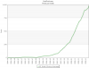
For a 40 week moving average, I calculate the average over the past 40 weeks (instead of the past 6 weeks).
What this does is smooth out the data in the graph - stops it from jumping around from week to week, and instead you see the broad "trends" in the data rather than the raw data itself.
The longer the average period, the smoother the graph (which is why I use 40 weeks instead of something like 6 weeks).
The only downside is that the graph trades accuracy for smoothness ... the smoother you go, the less accurate it is from a week by week basis. Conversely, the more accurate you make the chart, the less smooth it is - you get a chart that jumps around and makes it difficult to detect the underlying trend (eg an uptrend or downtrend in the number of posts being made).
Moving averages are often used in trend analysis of large volumes of data ... looking at the long term trends in the price of stocks on the sharemarket is one example where it is used a lot.
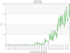
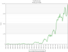
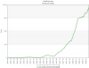
I've attached some variations on the chart using different averaging/smoothing, from no smoothing (raw data), through to 6 week moving average, then 20 week moving average, and finally 40 week moving average. You can see quite clearly how the averages hide the "mess" shown in the raw data.
Hope this helps!