You are using an out of date browser. It may not display this or other websites correctly.
You should upgrade or use an alternative browser.
You should upgrade or use an alternative browser.
ZooChat is 18 years old!
- Thread starter Simon Hampel
- Start date


It can. Drink, drive, sex and vote all in one birthday. What can go wrong?Can it drink in Australia though?


Platypusboy
Well-Known Member
Happy birthday to Zoochat!

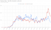
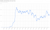
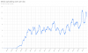
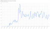
B32. Posts per day - top 50% of posters vs the rest (90 day moving averages)
In the past, I've tried looking at the breakdown of posters using an approximation of the 80/20 rule (20% of the posters generate 80% of the content) - but found that the patterns largely just followed the overall post volume and didn't give us any new insights.
So this time, I decided to look at comparing activity between the top posters vs the rest - split right down the middle.
I started by investigating which members contribute the majority of the posts (and comments - I'm treating them as the same thing). Here's what I found:

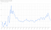
Now, the key thing to remember is that this is measured based on what the users have done now - not what they had done at the time. So if the red line is higher - that indicates that the users who posted at that time are still not in the top 50% now.
It's unsurprising that there was a peak in 2009/10 from new users - we did have a massive growth period leading up to that point.
It's also unsurprising that after that peak, the blue line takes over - that is the growth of our "top posters" - where the frequent posters start to post more than the occasional posters.
As time goes on, the older, more established members are at a natural advantage - they've had more time to make their posts and so will likely have a much higher total overall.
A growing red line later in the chart shows an increase in depth of the site - there are more people contributing now and the post volume isn't just coming from the top posters. This is generally a good thing.
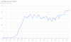
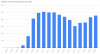
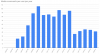
Looking at the earlier chart of new member registrations - we've just had our biggest year ever for new members joining and we've never had more people contribute to posts than we have now.
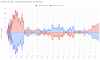
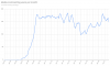
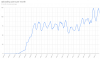
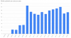
Let's look at the data a different way.
On the basis that the top posters post approximately 50% of the posts, while the rest post the other 50% - we can take the mid point of our daily posts as a median. Meaning, on any given day, we expect our top posters to make approximately half of the posts.
The reality of course is quite different - not everyone posts consistently, so our top 68 members won't post all the time (indeed, some are relatively new and so didn't contribute to the early volume - while others have dropped off in their posting activity, and so don't contribute to the later volume.
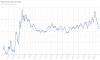
This chart attempts to show that difference - by looking at how far from the mid point each group is.
Above the line means that the group posted more than half, below means they posted less.
That peak near 50% for the "bottom 50%" in late 2005 means that the "bottom" group posted nearly 100% of the posts (50% higher than the 50% mark is 100% !!)
So as of Oct 2021, the "bottom 50%" posters are making nearly 20% above the median number of posts, while the "top 50%" are making nearly 20% less than the median.

I'm not sure it means that much overall - but it is pretty
In the past, I've tried looking at the breakdown of posters using an approximation of the 80/20 rule (20% of the posters generate 80% of the content) - but found that the patterns largely just followed the overall post volume and didn't give us any new insights.
So this time, I decided to look at comparing activity between the top posters vs the rest - split right down the middle.
I started by investigating which members contribute the majority of the posts (and comments - I'm treating them as the same thing). Here's what I found:
- From launch to our 18th anniversary, we've had 5,994 members post on ZooChat
- In that same period, we made 1,166,451 posts
- I found that 68 members made 50% of the posts - that's 1.1% of the members making 50% of the posts
- In summary: if you have made at least 3,271 posts then you are in the top 50% of posters, if we measure it by contribution to the overall post total
Now, the key thing to remember is that this is measured based on what the users have done now - not what they had done at the time. So if the red line is higher - that indicates that the users who posted at that time are still not in the top 50% now.
It's unsurprising that there was a peak in 2009/10 from new users - we did have a massive growth period leading up to that point.
It's also unsurprising that after that peak, the blue line takes over - that is the growth of our "top posters" - where the frequent posters start to post more than the occasional posters.
As time goes on, the older, more established members are at a natural advantage - they've had more time to make their posts and so will likely have a much higher total overall.
A growing red line later in the chart shows an increase in depth of the site - there are more people contributing now and the post volume isn't just coming from the top posters. This is generally a good thing.
Looking at the earlier chart of new member registrations - we've just had our biggest year ever for new members joining and we've never had more people contribute to posts than we have now.
Let's look at the data a different way.
On the basis that the top posters post approximately 50% of the posts, while the rest post the other 50% - we can take the mid point of our daily posts as a median. Meaning, on any given day, we expect our top posters to make approximately half of the posts.
The reality of course is quite different - not everyone posts consistently, so our top 68 members won't post all the time (indeed, some are relatively new and so didn't contribute to the early volume - while others have dropped off in their posting activity, and so don't contribute to the later volume.
This chart attempts to show that difference - by looking at how far from the mid point each group is.
Above the line means that the group posted more than half, below means they posted less.
That peak near 50% for the "bottom 50%" in late 2005 means that the "bottom" group posted nearly 100% of the posts (50% higher than the 50% mark is 100% !!)
So as of Oct 2021, the "bottom 50%" posters are making nearly 20% above the median number of posts, while the "top 50%" are making nearly 20% less than the median.
I'm not sure it means that much overall - but it is pretty