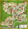
@Andrew_NZP Overall I think the Smithsonian map is okay. I don't like the animal head icons as much as I would like silhouettes or pictures or something, they don't seem very clear to me. Also I wish they could show the slopes and elevation differences, which is important since the entire zoo slopes down from the top of the map. I do agree on the great color scheme, though, and the paths are easy to follow with this.
You are using an out of date browser. It may not display this or other websites correctly.
You should upgrade or use an alternative browser.
You should upgrade or use an alternative browser.
Zoos on Paper: An Investigation of Zoo Maps
- Thread starter Coelacanth18
- Start date
-
- Tags
- map
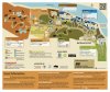
This is Binder Park Zoo's map, pulled from the Dropbox supplied by @TinoPup. I really like this one for a few reasons. The first is that it features silhouettes AND species labels, the combination of which avoids a lot of ambiguity. I also like that they have distance and estimated completion time for a lot of the paths; I think this gives people a better sense of the zoo's size and terrain. The color coding is good too, with the two separate halves (African and not African) of the zoo clearly distinguished.
My only current complaint would be that, like many maps, it doesn't show individual enclosures, which isn't a big deal but I do prefer it.

My only current complaint would be that, like many maps, it doesn't show individual enclosures, which isn't a big deal but I do prefer it.
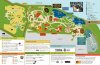
For what it's worth, here's the current Detroit Zoo map. I think it could use a bit more detail. How easy it is to use is hard for me to judge since I live within walking distance and I go at least once a month, so I know the place fairly well.
Note that north is on the right.
https://detroitzoo.org/wp-content/uploads/2018/06/dz-map-2018-april-web1.pdf
Note that north is on the right.
https://detroitzoo.org/wp-content/uploads/2018/06/dz-map-2018-april-web1.pdf
What are people's thoughts on cardinal orientation? I've noticed that zoos tend to orient their maps in all different directions with no clear pattern. Sometimes it annoys me a little if they aren't North-East-South-West oriented from top going clockwise as is the standard with most geographical maps I've seen, but I don't think it really makes much difference.
I much prefer them to be north-south orientated, although I can't think of any really good reason why I prefer it that way. Partly it might be because my first view if a zoo in map-form is on a road map/Google maps, where it is shown in correct orientation along with all the surrounding roads, route etc. Then, getting to the zoo and it's map having some random orientation is a little confusing.
I know that for London Zoo, the vast majority of their previous maps used north-south orientation, but their most recent ones haven't, and they just don't look quite right!
I know that for London Zoo, the vast majority of their previous maps used north-south orientation, but their most recent ones haven't, and they just don't look quite right!
Yes, I recently singled this out to @FunkyGibbon as the most aesthetically dreadful one I’d seen.
Florida really does seem to be where zoo map design goes to die. Behold the monstrosity that is the Brevard Zoo map.
Florida really does seem to be where zoo map design goes to die. Behold the monstrosity that is the Brevard Zoo map.
I remember that all too vividly from planning my Florida trip in 2013. A truly appalling map, that manages to make a nice little zoo look like an empty little zoo by not actually labelling any of the animals (to the point it was only photos of the zoo on other sites that reassured me it was worth going..!).
From what I just saw...that's a book.
Yi Qi
Well-Known Member
What book would that be?From what I just saw...that's a book.
What book would that be?
This one, I'm guessing: Children's Books by Local Author/Illustrator Benefit Cincinnati Zoo Lion Cubs - Cincinnati Zoo & Botanical Garden®
What are people's thoughts on cardinal orientation? I've noticed that zoos tend to orient their maps in all different directions with no clear pattern. Sometimes it annoys me a little if they aren't North-East-South-West oriented from top going clockwise as is the standard with most geographical maps I've seen, but I don't think it really makes much difference.
It's a widely observed convention to have north at the top of a map but for example if you see the Detroit map I posted above, the zoo property wouldn't fit on an east-west map. For what it's worth, I don't hear people who are not familiar with the zoo complaining about the map.
Lyndsay and Lainey Lion - Books for Kids Who Love Animals!What book would that be?
in terms of functionality they're decent.
Is Jacksonville's really good in terms of functionality. All the paths are semicircles and none of the enclosures are depicted with any degree of accuracy.
Any tips on a route when visiting Colchester? When I visit for the first time in the summer, I don't want to end up walking around and around and exhausting myself.
I've only been there twice myself, but I would suggest going to the leopard and lion keeper talks (much more likely to see them active). The tigers are viewable at the end of the day. Don't really think any of the others need special times, although if you haven't fed an elephant ever, it is fun to do although there is always a queue to do it! Try and follow the sometimes not so helpful path lines on the map and if you do get lost, just walk decidedly in one direction and you will arrive at an enclosure depicted on the map.
Ah, Ok, I was trying to think of a reason why the zoo would have koalas and yet such a terrible map!
")
I find it kinda funny that you seems to not notice there's a Platypus in that map.. And since the only Platypus outside of Australia is in San Diego Safari Park, pretty sure you would've easily guessed that's a fictional zoo.
It's from a book, as stated above.I find it kinda funny that you seems to not notice there's a Platypus in that map.. And since the only Platypus outside of Australia is in San Diego Safari Park, pretty sure you would've easily guessed that's a fictional zoo.
It's a widely observed convention to have north at the top of a map but for example if you see the Detroit map I posted above, the zoo property wouldn't fit on an east-west map. For what it's worth, I don't hear people who are not familiar with the zoo complaining about the map.
Since this thread started I've asked some obviously out of town visitors if they had a problem reading the Detroit map. One guy said it took him a moment to realize that the map was not north south but otherwise people have said they found the map reasonable and easy to follow.
I feel like some zoo maps have had serious "downgrades" from previous ones. Here are some examples.

San Antonio - before - Sure the clipart is kind of cheesy, but the map has a good color tone and it is easy to locate the animals.

San Antonio - Now - Overly colorful with very bad color scheme and proportions. What's up with the three elephants when there are one of every other animal?

National Zoo - before - Nice color tone, easy to understand icons, nicely designed icons, not to cartoonish.

National Zoo - now - We've got neutral navy blue clashing against bright green, purple and orange (Which clashes against itself may I add). The icons are extremely hard to understand (They had to put a key in the back), the animals just represent the attraction, not the animals in the attraction, and the buildings are blocky.

Fort Worth - before - Number one - The 3D buildings are off yes, but animal icons here are just well done. They look realistic but are surpassingly simplistic, I feel like the icons would work great on this map
It has a great color tone and is very realistic, but the silhouettes ruin it.

Fort Worth - now - blocky, boring, silhouettes that are confusing (The Indian rhino could easily be a hippo.) and no way of really knowing where you are with those flat buildings!

Indianapolis - before - yes, silhouettes a bit weird, but the map has a good color scheme (different colors for each zone that don't clash with each other), and is simple, yet had key landmarks like the dome and the dolphin building to help you when you're lost.

Indianapolis - now - clashing color scheme, flat buildings, blocky enclosures, and of course the silhouettes.
I might do a zoo map upgrade later, but for now I'm done. I don't mean to be harsh to the designers, they're probably better then me, but as a zoo map nerd, I just am not a big fan.
San Antonio - before - Sure the clipart is kind of cheesy, but the map has a good color tone and it is easy to locate the animals.
San Antonio - Now - Overly colorful with very bad color scheme and proportions. What's up with the three elephants when there are one of every other animal?
National Zoo - before - Nice color tone, easy to understand icons, nicely designed icons, not to cartoonish.
National Zoo - now - We've got neutral navy blue clashing against bright green, purple and orange (Which clashes against itself may I add). The icons are extremely hard to understand (They had to put a key in the back), the animals just represent the attraction, not the animals in the attraction, and the buildings are blocky.
Fort Worth - before - Number one - The 3D buildings are off yes, but animal icons here are just well done. They look realistic but are surpassingly simplistic, I feel like the icons would work great on this map
It has a great color tone and is very realistic, but the silhouettes ruin it.
Fort Worth - now - blocky, boring, silhouettes that are confusing (The Indian rhino could easily be a hippo.) and no way of really knowing where you are with those flat buildings!
Indianapolis - before - yes, silhouettes a bit weird, but the map has a good color scheme (different colors for each zone that don't clash with each other), and is simple, yet had key landmarks like the dome and the dolphin building to help you when you're lost.
Indianapolis - now - clashing color scheme, flat buildings, blocky enclosures, and of course the silhouettes.
I might do a zoo map upgrade later, but for now I'm done. I don't mean to be harsh to the designers, they're probably better then me, but as a zoo map nerd, I just am not a big fan.
Attachments
-
 3157e96434675ea24f1a69e1340bd115.jpg169.6 KB · Views: 49
 -
 bc2785e4d5c69aa81a1de39ddccba26d.jpg79.7 KB · Views: 48
 -
 2019-0715-police_health-map_m1-conn-entry-36x37-2018.png669.5 KB · Views: 48
 -
 fort-worth-zoo-map.jpg105.9 KB · Views: 44
 -
 f362ec225aa7a5635dcc653ada06fdfc.jpg158.9 KB · Views: 49
 -
 web_map.png1.2 MB · Views: 49
 -
 806_thumbnail-1024.jpg167.8 KB · Views: 47
 -
 IndianapolisZoo_2019Map.jpg176.2 KB · Views: 46


Wait, so it got worse or better?
Here's Cincinnati Zoo's older map.
This is the map now...